Sirens of Titan

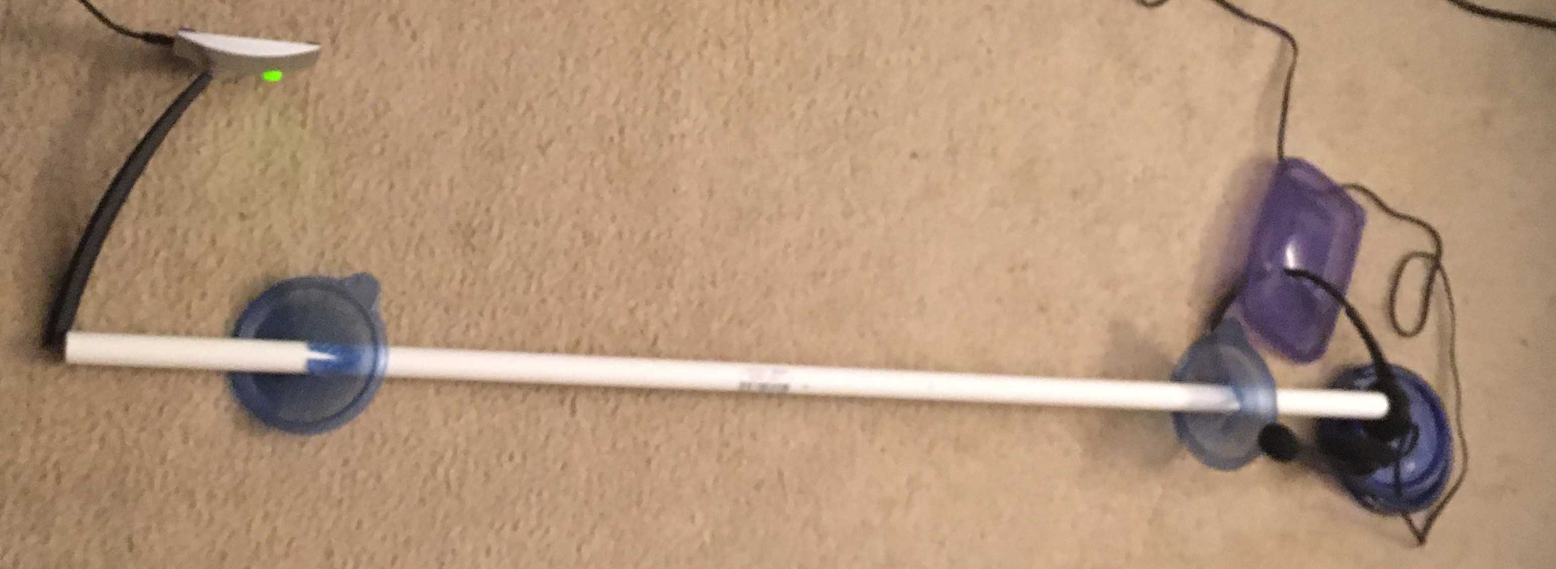
I wanted to explore my speaker’s directionality by making a jig that could hold the microphone in fixed relative positions to the headphone. My overarching goal was to be able to isolate the behavior of the microphone from the behavior of the headphone speaker.

This is what I came up with. The use of hard, rigid, flat surfaces is significant, but not in the way I anticipated.

Jig for holding desktop microphone inside frame and speaker in position.

The slotted food boxes make a rigid frame with holes to allow the microphone to be placed in different positions. The shipping box is marked with a pencil outline so that the headphones can be placed consistently. The edge of the box fits against the slotted structure. I only used the speaker on the side that faces the microphone. I didn’t use the perpendicular speaker nor the microphone on the headphones.

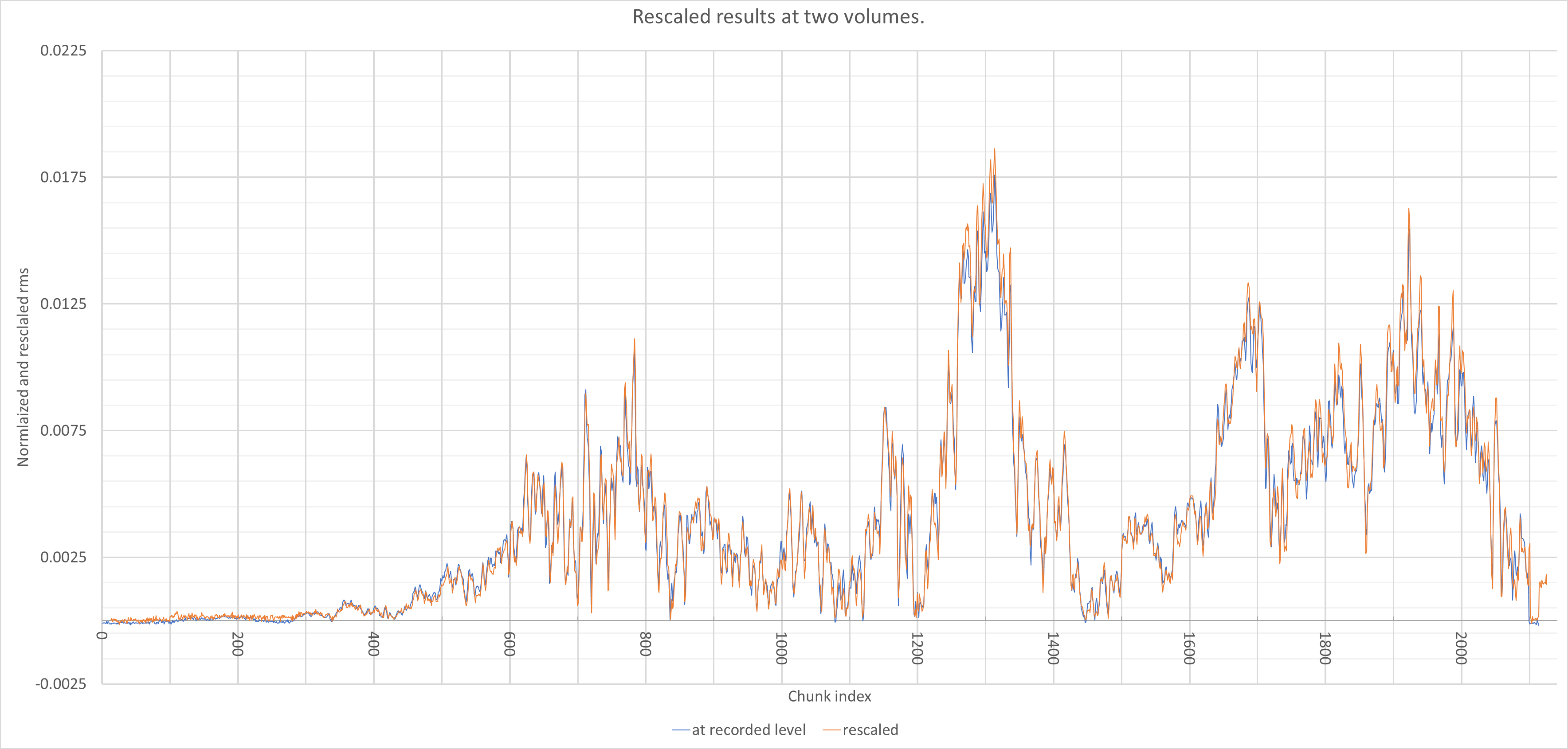
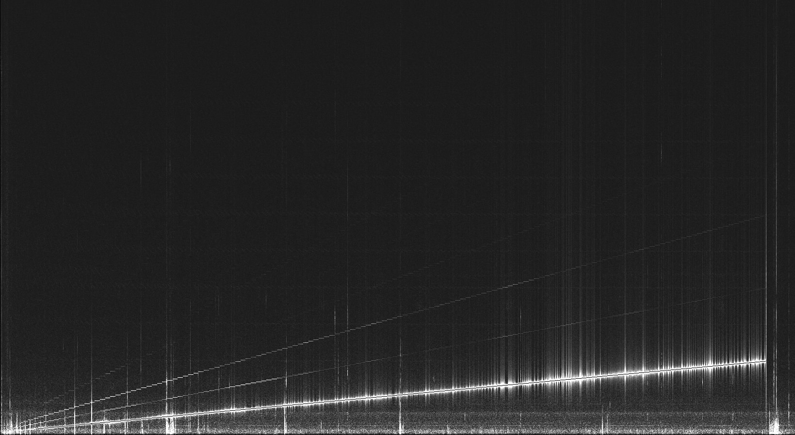
Again, I did a sweeping sine wave. When I analyzed the results, I found an interesting waveform around 120Hz. In the first graph, the frequency was sweeping from about 118.8 Hz to 121.2 Hz. At first I thought that what I saw was some kind of audio interference pattern. But that didn’t make sense because the graph shows large changes between slight frequency changes (and thus slight audio wavelength changes.)

This graph covers about 33.5 seconds of recording. By slowing down the rate of change of the frequency, there are more samples over the course of the transition and noise interferes less. (The spike to the left was due to noise from a car passing or me moving on my chair.)

Magnitude of the sound recorded as the audio frequency swept from 118.8 to 121.2 Hz.

I was trying different adjustments to the configuration to identify the parts that are responsible for the resonance. My first try was apply force to the front wall of the food containers. This had only a small effect on the behavior. My second adjustment was to place crayons on the box out of the line of sight between the speaker and microphone. The resonance was completely gone in that case.

The third adjust I tried making was to put some weight on the box, also out of the line-of-sight. I placed several CD discs on the box. The lower one had some CDs laying on the box and there is an obvious change. The graphs aren’t synchronized.

Top sweep with unmodified setup, bottom with CDs on the shipping box

What I understand now is that these effects are due to resonances within the box that the headphones are on or between the headphone’s strap and the box. Changing the forces on the box caused substantial changes.

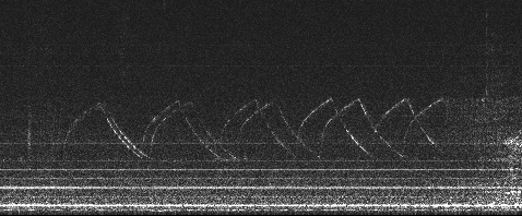
Another way that I visualize the data is to break the signal into equal sized blocks of time and perform a Fourier transform of the block and plot them as an image. Pixels closer to the bottom edge of the graph represent lower frequency components of the signal.

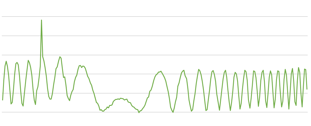
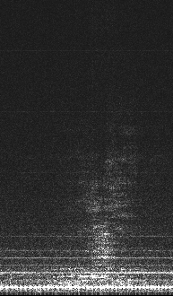
I found this strange shape in the first graph I created. I created graphs from other runs and none of them had anything like this.

Part of a chart showing Fourier transform of recording a siren passing

Then I remembered a fire truck siren that I heard a few blocks away when I was recording one of the results. It’s interesting to see the shape. It’s a repeating pattern of the tone rising rapidly, followed by the tone falling more slowly. I notice that that the same shape is repeated twice with difference delays which indicates there were two sound sources cycling at different speeds.

I had other things happen that I wasn’t looking for as well.

A “thump” from me moving the chair or coughing

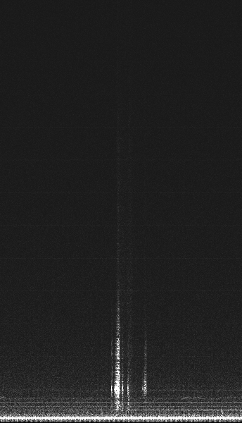
I received a text while I was recording.

The tone for a text on my phone “Glass”

There were several smudges like this next one in the plots. They are due to cars passing. I was recording in the daytime so there was more traffic than at night.

Car passing

There is an unlimited list of sounds that I could analyze to see more interesting patterns.

I ended up finding another rabbit hole just by looking at one position of the microphone and haven’t explored how other positions differ. However, I may have seen enough to know that I haven’t found the key to need to isolate the speaker from the microphone. Without a more sophisticated setup, the environment is going to be a confounding effect. In addition, my jig only works with one microphone and different speakers can’t be positioned with an equivalent geometry.

Noise?

I’ve been doing new experiments analyzing the results of using the microphones without a pipe for resonance. I was expecting flatter results with less noise because of the removal of the resonator. What I found was a lot different.

There were two directions that my search took. One was to run the same geometric configuration with identical input signals or two that are only different in volume. The other direction was to use different speakers to help tease out what effects are by the frequency response of the microphone, the frequency response of the speakers and variation caused by echoes in my work area.

My audio source was a pure tone swept linearly between 40 Hz and 8000 Hz over a timespan of 4, 8 or 12 minutes. Because the sweep is linear, the right half of each graph covers about one octave while the left half shows about ten. That would indicate that I’m emphasizing only a small part of the sound spectrum. I started working with a linear sweep to show as many resonance peaks as I could. That led to that emphasis.

The first effect I found was that the same configuration creates the same signal. I thought that the oscillating waveforms would an effect of random noise. The surprising part is that although it looks like a noisy waveform, it’s a reproducible and pretty consistent.

This graph shows two runs with the same speaker and microphoone in the same geometry but different volume input signal. There were minimal adjustment to get the graphs to line up. However, if they lined up perfectly, there would be no blue.

One interesting measurement is that temporally stretching the sweep into different duration scans also have a similar consistency in different runs.

The way I get these graphs is to record the microphone and then break the waveform into short chunks that are delimited by zero crossings of the signal. Each chunk has its samples squared and the square root of the average recorded.

Although the graph above looks pretty noisy, because the graph is consistent, there’s more going on. I performed the same chunking with the raw input signal below. There is a little noise, but it is substantially smaller than the variations in the above signal.

The x axis of each graph is indexed by the chunks in sequence.

The other question that I would like to answer is the manner that the speaker or microphone have different frequency response curves. I took three speakers that I have and ran the same input sequence. I couldn’t get the geometry of the speakers identical between the runs, so the effects of reflections off objects in the room are an unexplored effect.

What I saw when I analyzed the graphs and placed them together is that there is a big variation in the sounds recorded from each speaker. I don’t see anything that is obviously due to distortion from the microphone. I can’t say that it isn’t there but the effects of the geometry and the difference between the speakers appear to swamp any effect of the microphone.

I’d like to do more work exploring the effects of changing the geometry on the results as well as trying to identify the frequency response of each part of the system, microphone, speaker and room configuration. I’m not confident that I have enough data streams available to separate them.

One thing I learned is that making recordings during the day is fraught because of noisy traffic, construction work or lawnmowers. In the evening, the external noise sources are much lower. Another thing I learned is that collecting this data is time consuming. Each run takes 4 – 8 minutes which adds up.

One goal is to make some jigs so that I can reproduce the geometry from one day to the next.

Musical instruments and resonance

I’ve started a project exploring musical instruments and the physics controlling their audio properties. Mostly I’m interested in brass instruments like a trumpet or trombone‒instruments that are tubular for much of their length. Brass instruments have a constant diameter at their beginning. As the tube approaches the end, the instruments become more conical until terminating in a flared bell. I chose them because I played the trumpet in high school. It’s familiar.

One book that I’m using to help understand what is happening is “The Physics of Musical Instruments, 2nd edition” by Neville H. Fletcher and Thomas D. Rossing. It has quantitative descriptions of the properties of real instruments.

One interesting idea is to consider brass instruments as “reed instruments.” For a brass instrument, the “reed” is the lips of the performer. This allows brass instruments to use the same equations as woodwinds. As a first approximation, lips and reeds have similar properties of interrupted air flow. It does make a difference whether the opening closes with increasing pressure or opens with increasing pressure so the analogy has its limits.

My first experiments have been with a pipe resonating at different frequencies. My method of creating data is to input a sweeping pitched sound to one end of a pipe with a speaker. The pipe resonates at different frequencies so that the intensity of the sound so the other end varies over time. This is a example configuration with headphones presenting the sound on the right end and a microphone picking up sound on the left. I haven’t calibrated the frequency response curve of the microphone and speakers.

For example, when I sweep the input sine wave from 50 Hz to 2000 Hz over 2 minutes on one end of a 1m 1/2″ PVC tube, the amplitude from the other end creates this graph. I measure the amplitude as rms (root mean square) by squaring the values of each sample in a block and then taking their average. This helps in comparing one block to the next.

time vs. amplitude

One thing I notice with such examples is that as the frequency goes up, there is more and more noise in the wave form. The shapes become more ragged. It should be easy to identify the time of the different peaks and thus their frequency but this and other sources of noise interfere.

If I take above run and make an image of its frequency distribution, I get this. The Y axis isn’t calibrated, but starts at 0Hz at the bottom. This chart has the whole duration of a single observation session. The graph above is trimmed to exclude the times that I wasn’t activating the system.

Time vs. frequency

An interesting feature of the graph are the higher overtones from the input sweep. They show up as lines with higher slopes than the main output. This example, I can see 4 extra lines, but different configurations of microphone and pipe may show only one or two. (The third overtone is barely visible above the middle of the run.) Also, if I look closely, I see very faint equispaced horizontal lines. I suspect that those are from my computer fan but I haven’t verified it.

The gray noise at the bottom of the graph are different noises from within my house. I haven’t identified the causes of those or their frequency. Some of the graph is marked with mechanical bumps that show up as lines starting at zero hertz. The vertical features centered on the main input frequency are a common feature of these charts. I’m not sure whether they are real or are an artifact of my processing.

(This representation doesn’t help me identify the position of the peaks.)

An interesting adjustment is needed when I break the signal into chunks. For the Fourier transform or other analyses, I need to block the chunks so that they end at the zero crossings of the input waveform. I pick a minimum number of samples for a block and then search further for the next positively sloped zero crossing. If I don’t do that, the sharp edges at the ends of a block add artifacts that hide real effects. The software I’m using for FFT, FFTW allows me to have non-power-of-two long blocks which is essential for seeing useful results.

iPhone privacy setting fail

Months ago, I made some adjustments to lock down my phone’s privacy settings. Today I found that I got bit by one of my changes. When I was locking things down, I disabled the microphone and camera for Safari.

Other useful apps, such as the MyChart medical records service, use the browser to do video calling.

My first attempt to repair the problem was to look for a bad settings for MyChart, but it didn’t show up there. Until I did a wider search did I find that I had hobbled Safari to my own detriment.

The reason I was unable to solve it in the past is that the problematic setting wasn’t in the obvious places. Camera settings, Microphone settings, Privacy settings and MyChart settings all looked irrelevant. Instead, it was in Safari settings. I hadn’t realized was so integral to other apps.

When they say that any sufficiently advanced technology is like magic, I thought that I would know the right incantation. I couldn’t find the eye of newt. It was hiding in the back of the produce department near the sign “Beware of the leopard.”